YesBank App and Bank Statement Design
Improving a bank statement and creating an accompanying mobile app experience while meeting research, technical, and time constraints.
Role
UX/UI Designer/Researcher. Took on other responsibilities as needed.
Group Size
5 people, primarily designers but everyone wore multiple hats.
Duration
Feb 2024 – Mar 2024 (about 1 month)
Type
Contest/Competition


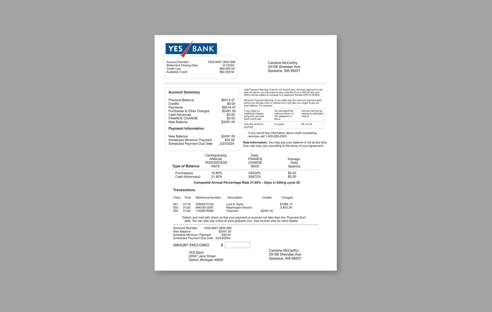
The original bank statement we were given to redesign.
Stage 1. Defining our needs
The first thing my team set out to do was define who our primary users would be and the biggest pain points for them. Caroline was given as the main person we would be designing for, but it's important to consider all other potential customers of YesBank.
Key Statistics
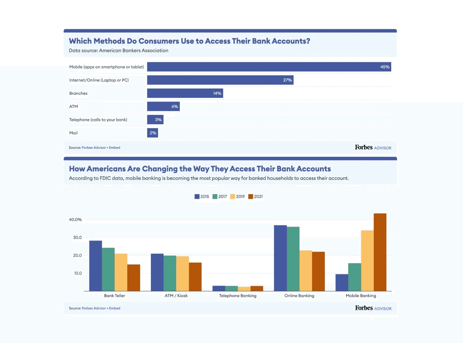
96% of households nationwide have at least one bank account. (FDIC)
86% of Americans, including older consumers, are digitally literate enough to use web/mobile to meet their routine banking needs. (Capital One)
The number of households using mobile banking as their primary account access method went up from 16% in 2017 to 44% in 2021. (FDIC)
Stage 2. Ensuring consistency and accessibility
When developing a design system to be used across all digital and print communications, a primary concern was to meet accessibility guidelines set by the ADA and other governing bodies. After researching this, we narrowed down our concerns to three main points of focus for accessibility:
Readability for those with colorblindness.
Readability for those with blind spots and blurry vision.
Diversity of modes of payment.
Focus 1: Incomplete Achromatopsia and Other Color Vision
Goal 1: Ensure text is visually clear and comprehensive
How we approached this:
Implementing colored backgrounds to comprehensively section information, following WCAG Color Contrast Checker of having contrast ratio of 4.5:1” (AccessibleWeb)
Print, web, and mobile prototypes have all been tested and meet the minimum threshhold color contrast ratio of 4.5:1.
Strategically choose a color scheme that are visually appealing and aligned with the ADA’s standards for achromatopsia vision (ADA Site Compliance)
Used one typeface family to reduce cognitive confusion (WebAim)

Ensuring we only used background/text accommodations of our branding colors that had an approved color contrast ratio by the ADA.
Focus 2: Blind spots and blurry vision
Goal 2: To ease readability and offer assistance as needed
How we approached this:
Using font size with a minimum of 12 point in our print channels to adequately address the needs of visually impaired people (Norwegian University of Science and Technology)
Partnering with third-party companies to provide braille bill statements, free of charge (Wells Fargo)
Including “Auxiliary Aids and Services”: voiceover function and AI assistance on digital platforms (ADA.gov)


Left: Our branding and style guide used for print, mobile, and web channels of YesBank to ensure brand consistency. Right: The same style guide through Caroline's vision (incomplete achromatopsia) to provide an example of what she and other users with similar vision see.
Somewhat unsurprisingly, the vast majority of Americans use banks, so our design needs to be comprehensive, intuitive, and accessible for a broad range of American bank users.
Focus 3: Varying modes of payment
Goal 3: To ensure customers of all demographics can access banking information via their preferred channel
How we approached this:
Researched primary payment method preferences of different banking customers
Included a wide range of information and payment channels, including credit/debit linking, ACH, mobile app, website, check, and mail-in options.

Page 1 of our redesigned bank statement through normal color vision (left) and the vision of Caroline (right) to show the effectiveness of our color scheme.
Stage 3. Designing and prototyping
Primarily solo
Brainstorming: Conducted an analysis of preexisting banking software and ran surveys to gauge which aspects of their designs were most liked by users. Conducted observational user studies to take note of the design choices in competitor apps that users may not recognize consciously as beneficial but which help them anyway.
Wireframing: Undertook the redesign of most app screens and flows that would be central to communicating the overall purpose and functionality of our app, addressing all competition rubric criteria. Emphasized the consistency of design across web, mobile, and print.
Mid-Fidelity Prototyping: Leveraged Figma's prototyping ability construct a story of our primary given user, Caroline, as she navigated our app and breathed life into our design. These prototypes focused on function over form, as the competition deadline was approaching and well-informed design choices were valued over impeccable UI.
As a team
Through combined efforts (with each of us specializing in one part of the overall design process), my team and I designed the following bank statement as a replacement for the old one. However, there were a lot more things to consider than simply graphics and accessibility.
In the following section, I'll give you a very quick overview of our other primary considerations for our print statement.

While consisting of more pages than the original, our new statement successfully segments information, meets and exceeds ADA accessibility guidelines, and provides a clear overview of all relevant information to the customer.
Stage 4. Legalities, mailing requirements, and other fine details
Much of the technical aspects of this competition were completely unfamiliar to me and my team, so we conducted extensive research to patch the gaps in our knowledge. So I don't bore you, here were were a few of the things we considered based on the competition rubric and our research.
Compliance and Legal Consideration: Accounted for varying state legislation definitions and guidelines surrounding what is considered a "late payment", the ranges of rates of interest, and other payment penalty details. anyway.
Transpromotional Marketing: Making use of white space by inserting relevant transpromotional marketing advertisements to Caroline (which, in her case, consisted of advertisements to open a Roth IRA and 529 Education Plan through YesBank).
Personalization via Variable Data Printing: Identified and checked the feasibility of the personalized aspects of our design through the Variable Data Printing (VDP) application XMPie.
Mailing Considerations: Ensured our bank statement fit in a standard-sized envelope, passed the "tap test" (described in image below), contained OMR, NCOA link system accessibility, an OCR scan line, an intellegent mail barcode, and fit the requirements for being first-class mail and qualifying YesBank a postage discount.
A few of the many mailing considerations we took into account when designing our product.


Stage 5. Our competition presentation
The day of
The day of our presentation of our work came around sooner than we had expected. We got everything done, handed in our work, and presented in a personalized, one-on-one setting, the reasoning behind our designs. Everything was scrutinized with a careful eye, but we presented confidently, thanking our regional judge and stepping out once we finished.
Hearing back
After much suspense, the regional judge (Dina Vees, a professor at Cal Poly) contacted us, stating that we were one of the top two teams in the regional bracket of the competition, and who would get first place would come down to a few points.
Placing
Within the week, we were informed we had placed second in the regional bracket. My team and I were already surprised we had gotten this far, so we accepted the position thankfully and continued on with our day.
Stage 6. A new adventure begins
Securing funding
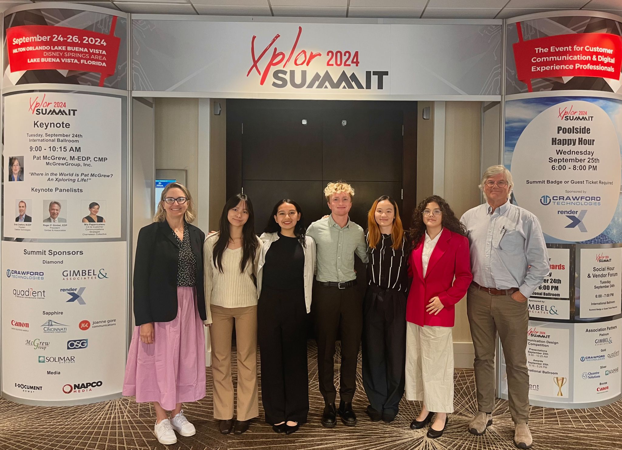
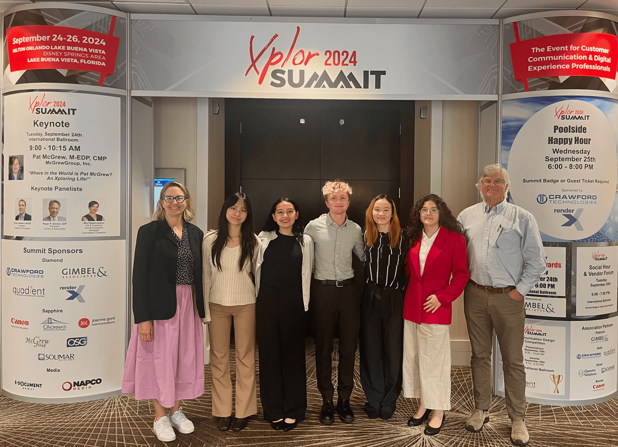
We went along with our lives like normal that following month until the judge reached out to our team once again. Apparently, since the competition had been so close between the final two teams, she had contacted the organizer of the Xplor International annual conference to see if we could attend to make connections in the industry and witness the first place team from Cal Poly compete in the national bracket. The event organizer, Jennifer Smith, was kind enough to admit our team to the conference free of cost. Cal Poly pitched in for travel and lodging, and we were set.
We were going to Florida!

My team
My teammates for this project were awesome, feel free to reach out to them!
Team Members
Feel free to connect with my team members! While we all specialize in something different, all of us are open to new opportunities.
Other projects

PurpleTie App Redesign
Completely reconstructing the user flows, design system, and visual aesthetics of the PurpleTie mobile app from user research and testing.
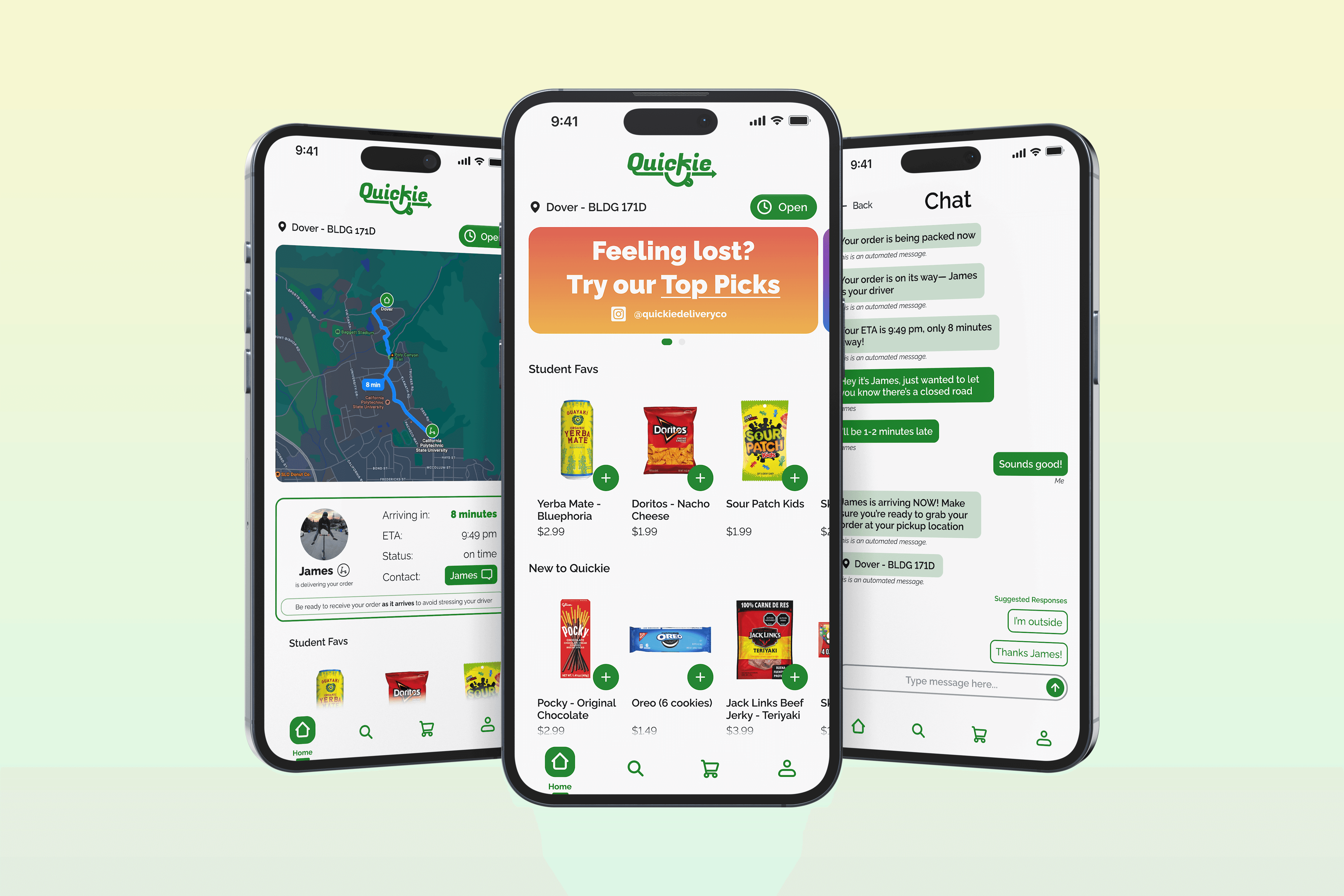
Quickie Delivery App: User-Requested Features
Streamlining customer communications and adding user-requested features for a formerly operational college delivery app.