PurpleTie App Redesign
Completely reconstructing the user flows, design system, and visual aesthetics of the PurpleTie mobile app from user research and testing.
Role
UX/UI Designer and Researcher, working on entire product design from research to conception to handoff
Group Size
2 Design Leads, 4 Designers, 2 Tech Leads
Duration
8 weeks (Jan 19–Mar 16)
Type
Professional


Week 1 Images


Week 1: Company Research
Constructing current user flows
Through individual and group experimentation of the existing PurpleTie app, we were able to document each step in the onboarding process. The onboarding flow, as we found out fairly quickly, directly led into the order flow.
Recording these initial steps highlighted some questions and concerns from the design team, but we didn't want our biases guide our research. We needed to see the impressions of actual and potential users.
Week 2 Images


Primary research takeaways
While many issues were identified, the three areas I focused on were:
App Navigability: Users continually had difficulty navigating within the PurpleTie app
Primary contributing factors:
Recurring page content (back button, navbar) positions often changed
Button touch targets were too small and sometimes inaccessible
Page and button text were vague, non-intuitive, and often conflicting


Pricing Transparency: Users expressed concern over lack of visible pricing information
Primary contributing factors:
Pages with information on pricing and services were not clearly visible
PurpleTie prices for some services are weight-dependent, while others are item-dependent, and thus cannot be calculated before a user checks out
Information and FAQ pages required multiple clicks to navigate to, interrupting the user order flow
Company Trust: Users interpreted outdated design as PurpleTie's lack of credibility
Primary contributing factors:
Lack of a cohesive brand identity across pages made users feel the company was fake or untrustworthy
Immediate request for a payment method upon onboarding, followed by a redirection to placing an order, was deemed intrusive
PurpleTie only accepts credit or debit card


These issues stemmed from PurpleTie's current app design, variable pricing structure, back-end development constraints, client preferences, and other factors beyond my control.
To maximize my impact while working within these constraints, I focused my personal efforts on the above issues identified from our research.
Week 3 Images

Week 3: Decide
Defining next steps
From our analysis of the above research data in conjunction with feedback from our client, we decided to:
reconstruct user flows
create a new design system
redesign interactive and informational components
…all while preserving the app's core functionality, simplicity, and PurpleTie's brand image.
Deciding on a visual style
To settle on a visual design style, we created moodboards, compiling designs from apps thought had relevant elements. Our team settled on a clean, simple, highly modular design. We chose this design style to:
reduce information overload (sectioning blocks of text, different services)
ensure the app was usable for all audiences (larger tap targets, simple font)
feel clean and professional (rounded corners, simple color scheme, dark mode)
Our initial font choice was Area, a clean sans-serif Adobe font with a variety of weights, and eight shades of the brand's purple along with shades of grey. However, these had to be changed later due to technical constraints and contrast issues.
Completing new user flows
At this point, we finished reworking the original user flows, decided which flow we would each focus on, and which screens needed to be created for each flow. I took on the @Home order flow which was central to the app's core functionality.
Week 4: Build
Building the foundation of our app using our reworked user flows would be key to later phases of designing. We focused on function over aesthetics for this portion.
Crazy 8's
Crazy 8's, or sketching eight designs every eight minutes, helped us draft as many designs as possible in the little time we had. Hand-drawing designs helps ensure perfectionism is cast aside in favor of composition.
Explaining our personal sketches to one another during our weekly meeting allowed us to create a more cohesive vision of what PurpleTie would look like.
Prioritizing quantity over quality, and concepts over execution, is key for early-stage designs. These are not all the designs we created, just the ones we remembered to photograph at the time.

Low-fi sketching
We took the best of our Crazy 8 sketches and digitally translated them into our Figma file. However, we had to limit ourselves to shades of grey, placeholder text, and simple blocks to define screen sections, as we were a little too excited to finally create the app that we had been thinking about for weeks.
We had to take a step back, slow down, and not marry ourselves to any particular design. It was too early in the process for that, and any design deemed "great!" at this point would still go through countless iterations.
Our low-fidelity designs on Figma. For some screens, we created different versions that we could discuss as a group and vote on our favorites.
Weeks 5-6: Refine
Moving on to mid-fidelity
Right off the bat, it's important to state that there were hundreds of design adjustments made throughout the mid-fi period, which was made possibly by taking advantage of Figma's comment system and often not tracking smaller changes across different versions of our flows.
However, we made sure to document our overarching progress through the use of different versions for larger-scale adjustments, as I'll go into more below.
Comments were vital to creating so many minute changes to each of our mid-fi iterations within our designated timeframe. We ended up with 622 comments in our Figma file for PurpleTie.

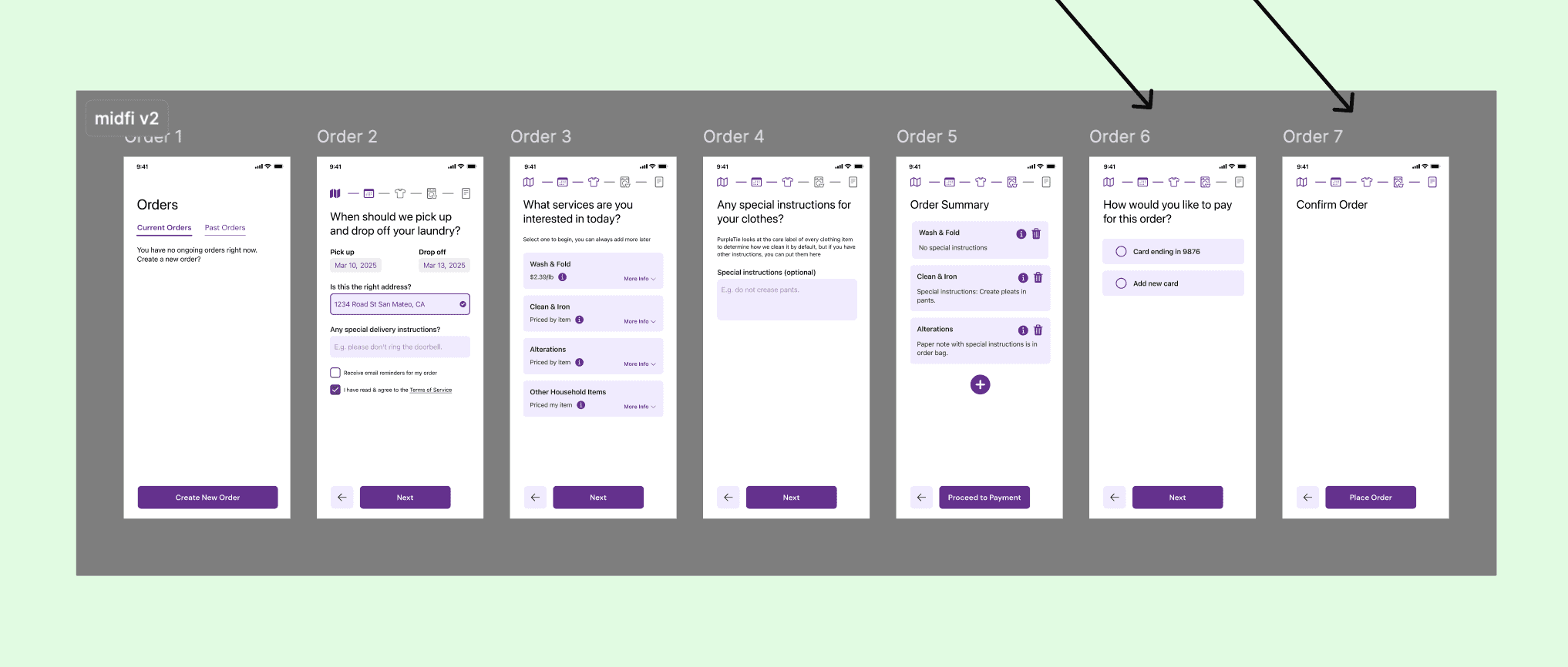
My mid-fi designs
My focus for the mid-fidelity stage and onward was the @Home ordering flow. This was the core flow of the PurpleTie application, so the effort I put in here would play a large role in the success of our project. I was excited: this was my first opportunity to showcase my abilities and have my work reflected in an app that would be shipped in the near future.
Below are the primary three versions of my mid-fidelity designs (with comments hidden), and I'll walk you through how research was integrated next.
Images 1-3: The three primary iterations of my mid-fi designs, including componentry I built and temporary body copy (some of which ended up being less temporary). Note that some components have been updated or altered since these were constructed, hence the inconsistent spacing on some screens.
Image 4: The references I used for design (from Apoorva's low-fi designs, which we all liked) and user flow (from my earlier low-fi designs).


Integrating research into mid-fi designs
As I stated earlier, my three main areas of focus from our research were app navigability, pricing transparency, and company trust. Here's how I addressed these areas in my mid-fi designs:
App Navigability: Focused on the repetition of spacing and elements across screens
What I did:
Placed buttons and other navigational components consistently and added clear call-to-action text
Added a progress bar and lower navbar to aide user orientation
Standardized element margins and padding to ensure screen resizability


Pricing Transparency: Made pricing information visible or easily accessible during ordering process
What I did:
Clearly displayed pricing strategy alongside each service
Added "info" icons next to pricing details which brings a popup with a complete breakdown of price per item
Added "more info" dropdowns to all service cards which provides a summary of each service
Company Trust: Ensured designs were clean, consistent, and intuitive
What I did:
Only requested customer payment information upon order placement
Linked detailed service and pricing information to the order flow and included it within the navbar
Made designs clean and consistent throughout all pages, maintaining a consistent brand identity


At this point, on my mid-fi order screens alone, I had received and addressed 92 comments (yes, I counted) from my design leads, teammates, our client, developers, and mentors. All of these were addressed before proceeding to later stages.
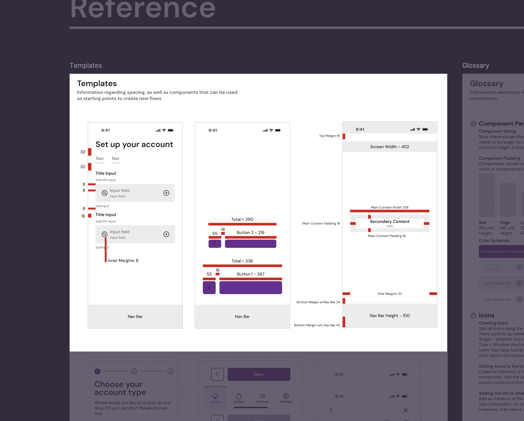
Creating a design system
A cohesive design system would drastically reduce this waste of time, computing developing power, and energy it took to implement our final screen layouts. While we all contributed to the design system, it was created and managed primarily by Jahan, one of the designers on our team.
We began by creating reference sections, a place where everyone on our team could refer to for standardized spacing, colors, typography, iconography, and more. Later, more refined, versatile versions of our components replaced the excess of inconsistent components which were made in earlier design stages.
Images 1-3: The reference sections we used to standardize our designs across pages.
Image 4: An example of nested styles used in a component, allowing for more customization within each component and reduced need for additional variations.
Image 5: A broader view of our complete design system.


Introduction to iOS Human Interface Guidelines
This was also the time to start integrating color and text styles. James and Noah, the tech leads for this project, gave a "How to Design for iOS" presentation at our week 5 meeting, which helped us realize that our Adobe font choice of Area was not ideal for a project like this.
We pivoted to SF Pro as part of our efforts to integrate our current design system with the iOS Human Interface Guidelines. We also began using a mix of native and non-native components (per recommendation) and reduced our color styles to the essentials.
Due to stylistic preferences, we ended up shifting our font one final time from SF Pro to DM Sans for our late mid-fidelity and remainder of our high-fidelity designs.
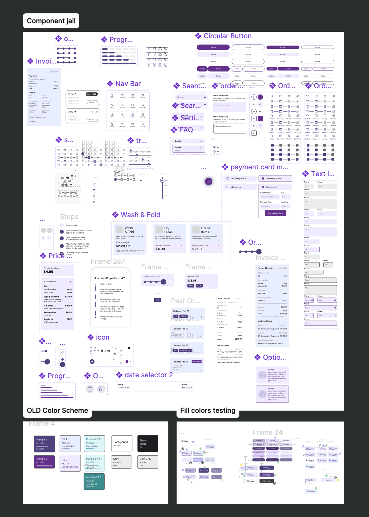
Here you can see some of the colors and components that didn't make the final cut, either because of client/mentor feedback, technical component limitations, or design pivots.
Weeks 7-8: Polish
High-fidelity designs
The final stretch had arrived: high-fidelity. As our final projects and exams approached, we began working later and later into the night.
Our high-fi period was so packed because we received a few last-minute changes from our client which involved shifting around many of the currently moving parts— namely, integrating the order flow into the onboarding flow, similar to how it was originally.
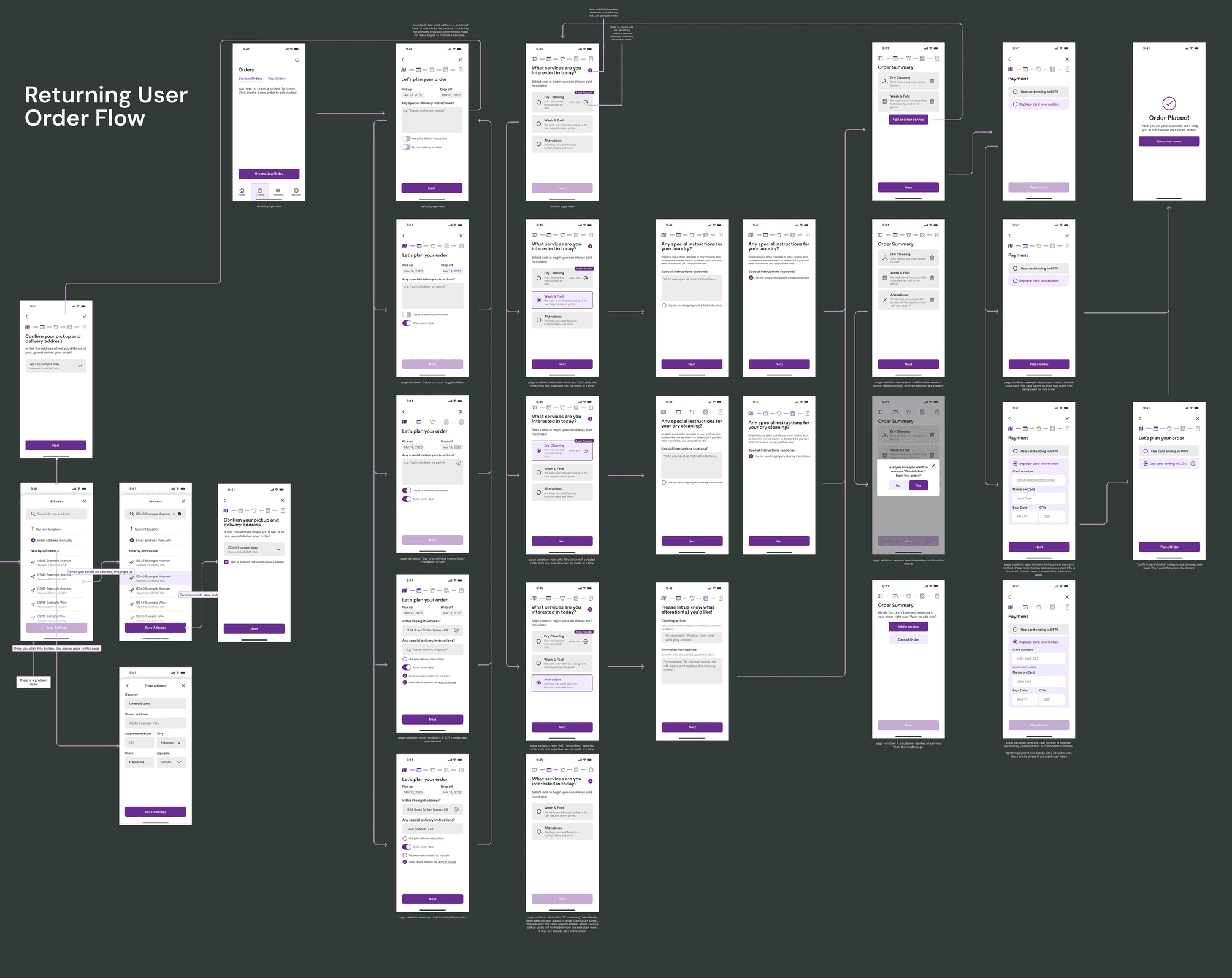
Final pivots
Our research showed that integrating the order flow into the user onboarding flow was deemed to be invasive by users, but our client had a strong preference for it to be that way. Hence, we ended up compromising by adding a "skip" ability for users to bypass the ordering flow, but have it included by default.
Our one-screen solution to the redirection of users from onboarding to the middle of an order flow, with the option to either proceed or go explore the app first, giving users the freedom to make their own decisions.

Images 1-2: My end deliverable: the user order flow. It includes a light mode, dark mode, and has standardized componentry, colors, and margins, as well as directional arrows and annotations for the developers.
Image 3: My mid-fi and high-fi designs for the order flow, in light mode, side by side.


Refining and prototyping
Final steps in our process included linking all color and stylistic variables to our screen content (for both consistency and dark mode), annotating our screens, and creating a simple prototype for our presentation.
A more robust Figma prototype is still currently in the works, as we could not finish a fully clickable one before our deadline, but we were able to successfully demonstrate the core features and functionality without too many bells and whistles.
We are currently in ongoing communication with our developers to ensure a successful app launch.
Prototype walkthrough
You can watch me click through our prototype below!
Outcomes
As this project is still currently in development, we do not have any "before/after" user metric data regarding app usage or qualitative customer perceptions of our redesign. However, I will add new information as we receive it here.
Feel free to reach out to me if you have any questions or comments about this project or others! I'm open to comments, feedback, or new opportunities.
Thanks for taking the time to read my case study :)
-Nate

Other projects
Title
Completely reconstructing the user flows, design system, and visual aesthetics of the PurpleTie mobile app from user research and testing.
Title
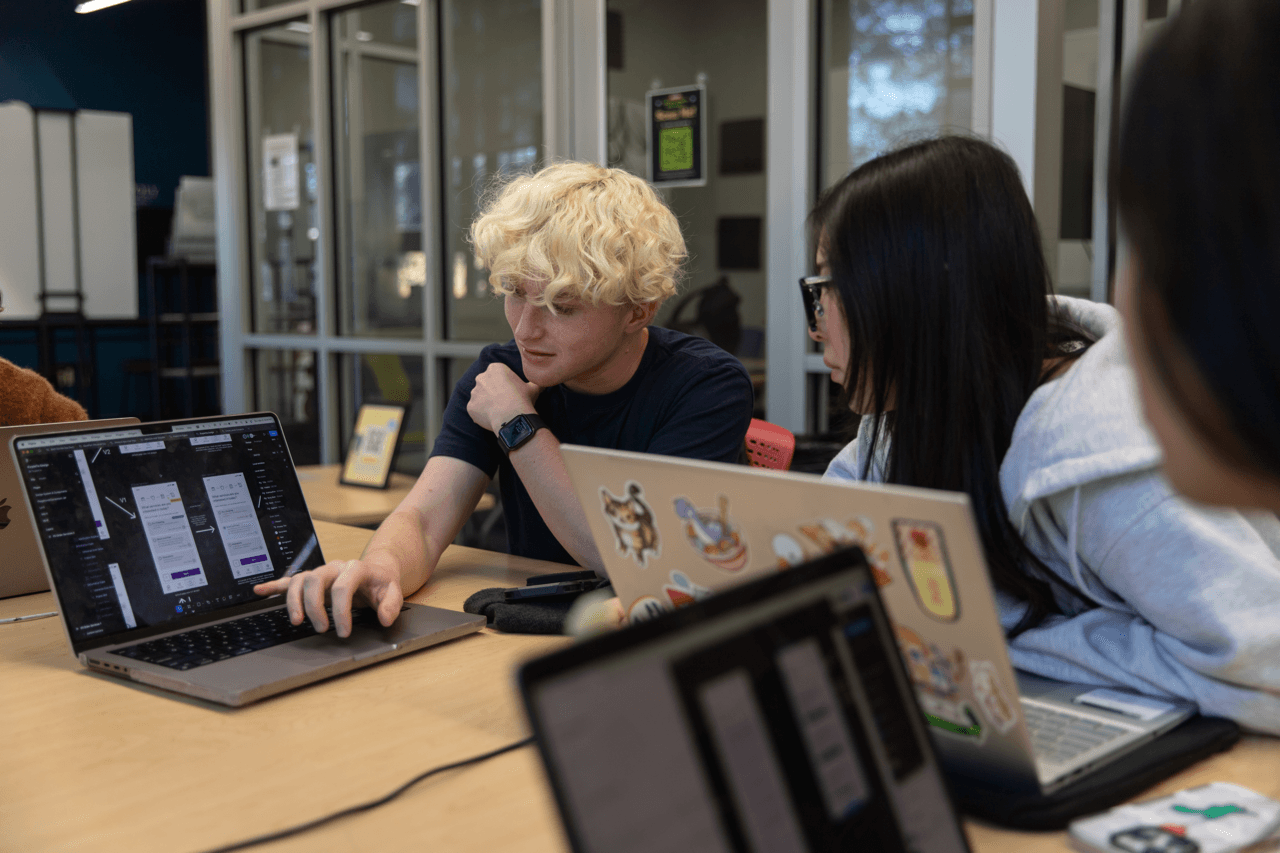
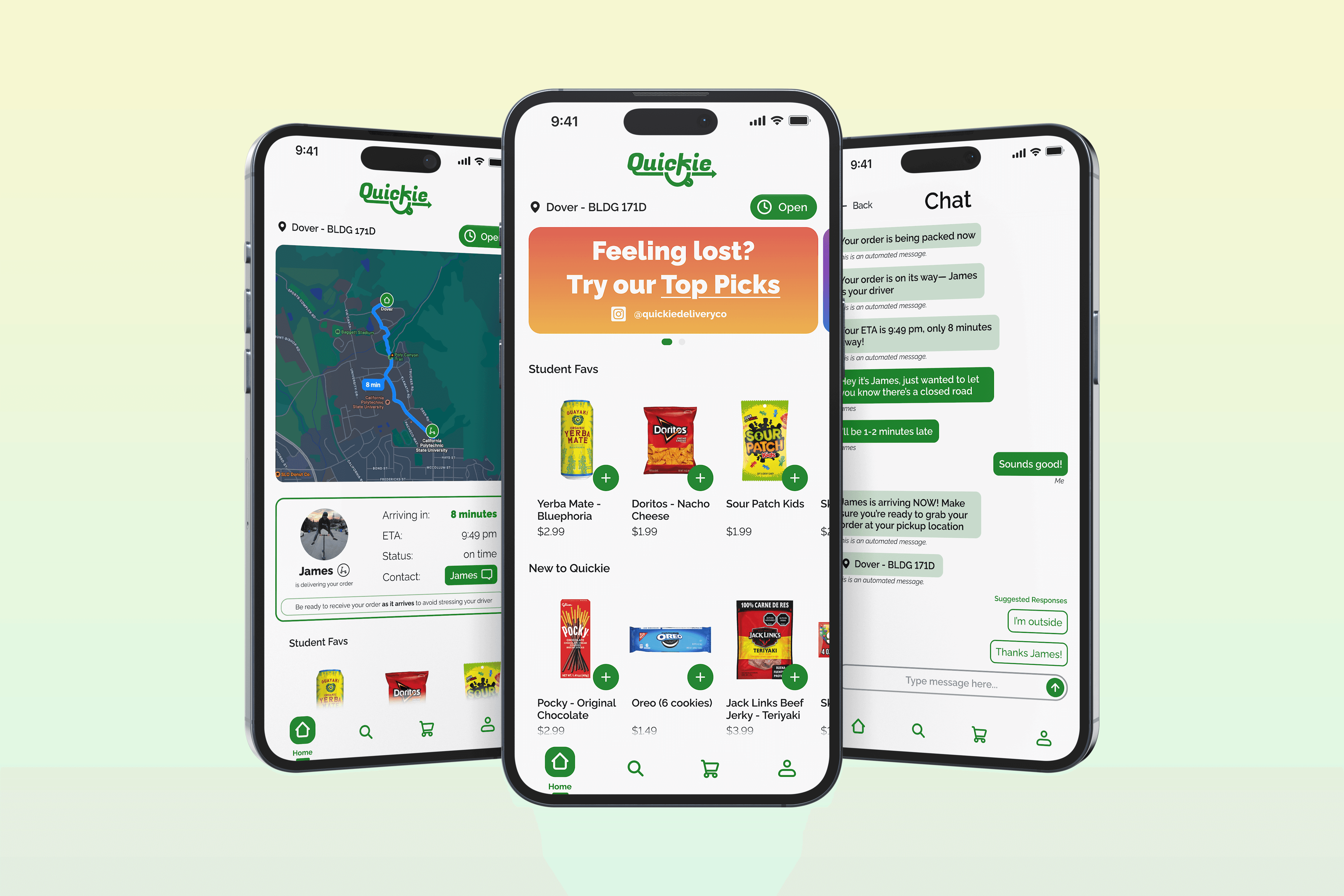
Streamlining customer communications and adding user-requested features for a formerly operational college delivery app.

Title
Improving a bank statement and creating an accompanying mobile app experience while meeting research, technical, and time constraints.